Responsive Toolbar Behavior
Problem
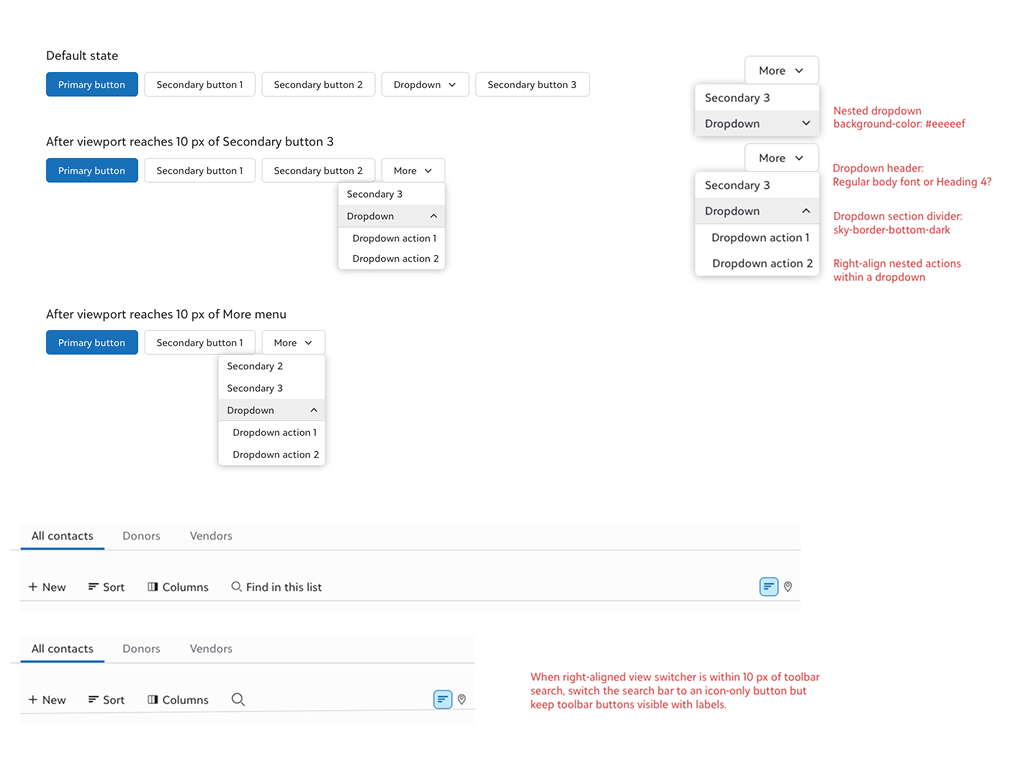
Toolbar components across the SKY UX portfolio lacked standardized responsive behavior, resulting in inconsistent implementations across products at different viewport widths. Without a defined standard, individual teams made their own decisions about how toolbars should collapse at smaller breakpoints, producing a fragmented experience across the platform.
I conducted an inventory of responsive toolbar behaviors across the full portfolio of Blackbaud experiences and developed a proposal for an updated responsive behavior that would progressively collapse toolbar buttons and dropdowns into a context menu as viewport width decreases. The proposal was adopted by the SKY UX team as the standard for responsive toolbar behavior.
Help Inline Injection
Problem
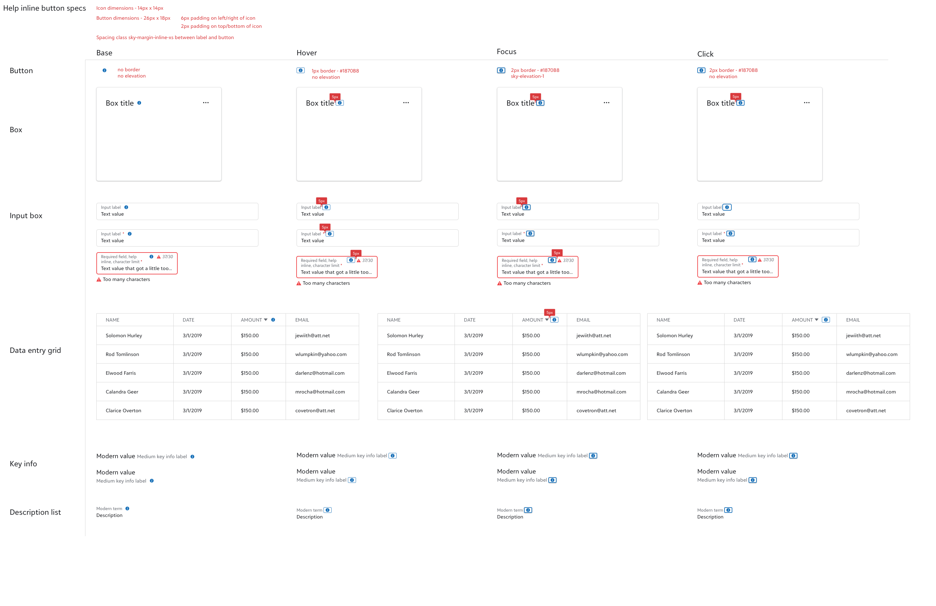
Teams using the help inline user assistance pattern had to manually implement the help inline button in combination with supported components, introducing inconsistency and additional implementation overhead across the platform.
I developed detailed specifications for how the help inline button should appear when used in combination with supported SKY UX components. The SKY UX engineering team used these specifications to add first-class support for the help inline button directly into all specified components, reducing the implementation burden for project teams and ensuring consistent behavior across the platform.
Page Layout Implementation Support
Problem
Page layouts had been a longstanding source of inconsistent implementation across teams using SKY UX. Without a systematic approach to spacing and padding, teams made individual decisions that resulted in visual inconsistency across the platform.
I developed a strategy to standardize how page layouts are implemented through the creation of custom properties that define specifications for page section padding and spacing based on page layout, media query, and visual theme. The custom properties were implemented by the engineering team following my departure, establishing a more consistent and maintainable foundation for page layout across the SKY UX ecosystem.
Internal Design Artifact Discovery
The SKY UX team conducts annual research with internal consumers to measure the usability and perception of the design system. Based on findings from one such survey, I led a discovery effort to investigate how designers and developers on project teams collaborate on designs using SKY UX and where friction arises in the creation and handover of design artifacts.
Methodology
Designer Interviews
7 semi-structured interviews with designers across 5 product teams.
12 questions covering usage of SKY UX design resources, construction of design artifacts, and collaboration with project teams on designs.
Developer Interviews
8 semi-structured interviews with developers across 5 product teams.
7 questions covering the process of implementing design artifacts, SKY UX design support, and collaboration with project teams.
Interviews were followed by thematic coding on the qualitative data gathered across both participant groups. Four key themes emerged from the research:
Findings
Component Details
The most frequently cited source of friction in design handoff — for both designers and developers — was accurately conveying which components are used in a design and what behavior those components support. There was shared confusion on both sides about how to communicate component implementation in a way that achieves the expected layout and behavior while remaining SKY UX compliant.
Redlining
Redlining emerged as one of the most effective tools designers can use to bridge knowledge gaps during handoff. Developers responded positively to its inclusion in design artifacts, citing reduced ambiguity and clearer implementation guidance as direct benefits.
Standard vs. Custom Work
Teams frequently struggled to understand where a design fit within standard SKY UX component behavior versus where custom work was required. Explicitly calling out custom elements in design artifacts helped developers scope and prioritize implementation work more effectively.
Working Without a Dedicated UX Partner
On teams without a dedicated UX designer, members relied on whatever resources were available to communicate designs, and generally perceived UX designers as more current on SKY UX design standards. This highlighted an opportunity to make SKY UX resources more accessible and self-service, and a need for more examples showing how patterns are used and built with components.
These findings were shared with the SKY UX team to guide future improvements to design system documentation, tooling, and consumer support resources.