
MARTA
MARTA Research and Analysis Dashboard

Summary
The Metropolitan Atlanta Rapid Transit Authority serves over 3.5 billion people in getting around the Atlanta area. In order to ensure that they provide their patrons with exceptional service, the MARTA Research and Analysis department conducts regular surveys of their assets, including buses, railcars, and transit stations. MARTA came to us to explore the improvements that could be made to the surveying process as well as the potential use cases for the data gathered through the surveys.
Team Members
Anusha Vasudeva
Ashok Krishna
My Role
Primary Client Liaison
User Researcher(User Interviews, Data Flow Mapping)
UX Design (Concept prototyping)
Skills Used
Generative Research (Contextual Inquiry)
Data Flow Mapping
Adobe XD
Duration
4 months (Jan 2019 - April 2019)
Project Ask
The Metropolitan Atlanta Rapid Transit Authority (MARTA) Research and Analysis Department approached my team to reimagine the process around collecting and analyzing the Passenger Environment Survey (PES), a form completed by MARTA surveyors to assess the quality and condition of all MARTA facilities. The survey consists of total of 189 service indicators that cover all transit environments from rail stations and railcars to fixed-route and mobility buses. Surveyors complete the PES on a tablet, capable of capturing and submitting images of any environmental issues. This data is sent back to MARTA Research & Analysis to contribute to a holistic understanding of the state of facilities across the MARTA transit network. Research and Analysis at MARTA was interested in gathering ideas of how they might improve the process of interacting with PES data in ways that might bring about a more meaningful relationship between the PES and its stakeholders.
“How might we enable new meaningful ways of interacting with survey data for analysts at MARTA Research & Analysis?”
Building Contextual Understanding
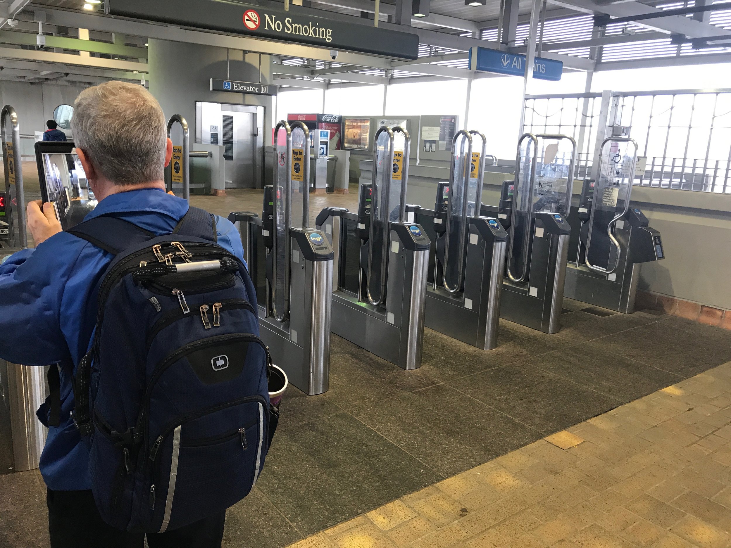
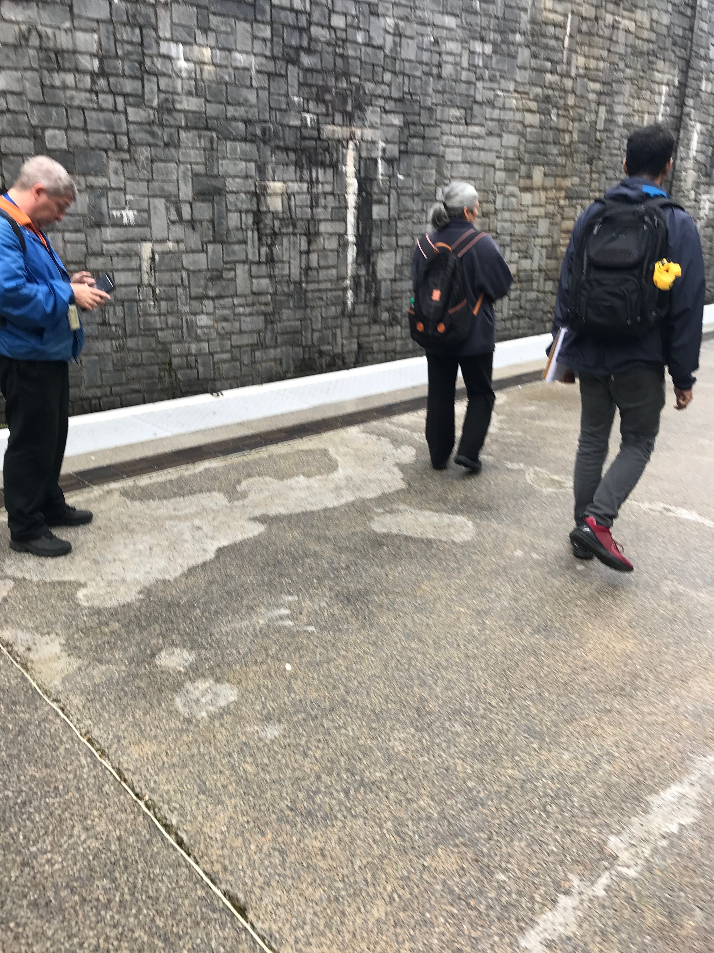
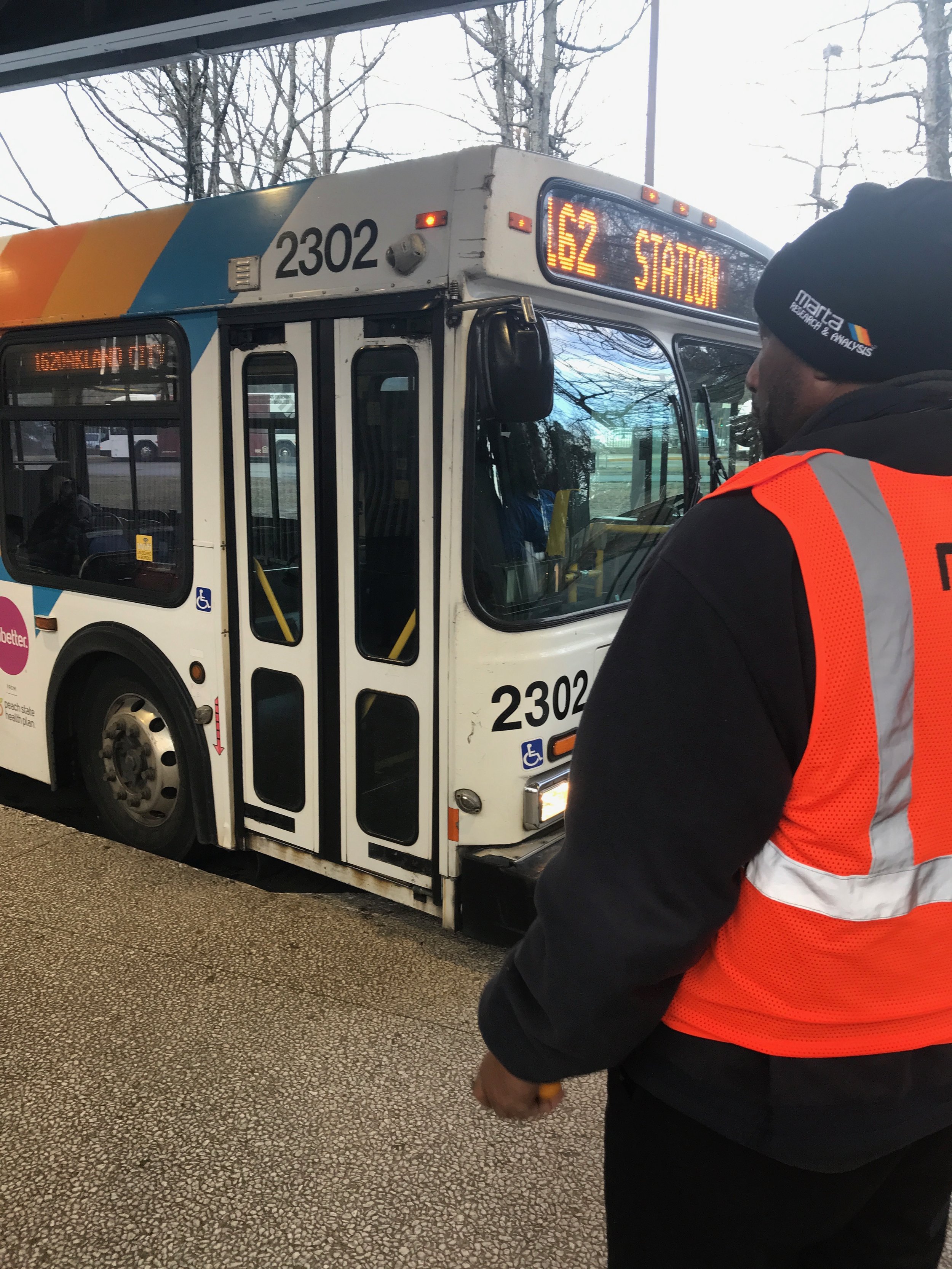
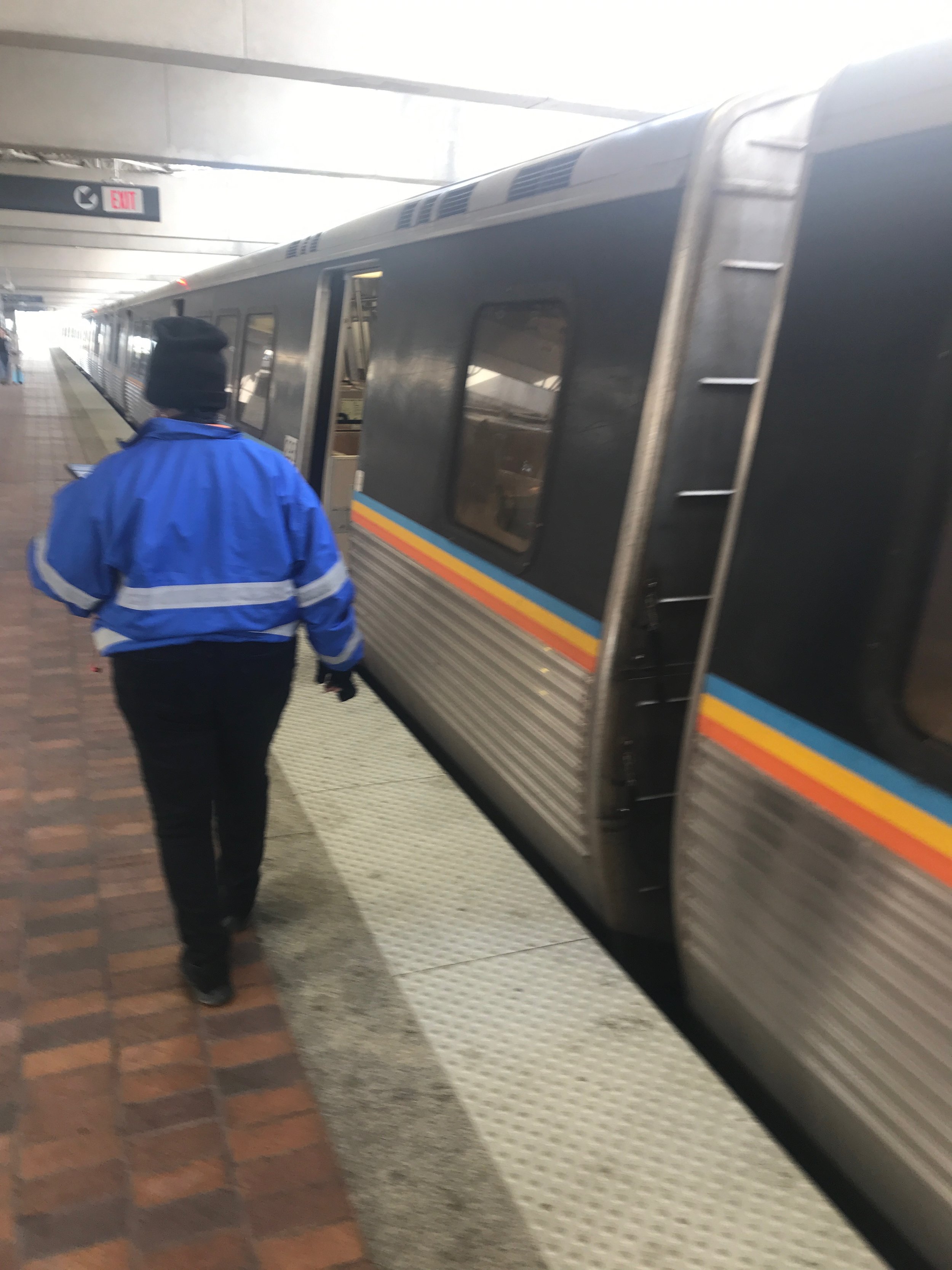
To better understand how the process around gathering PES data, our team shadowed five different MARTA R&A surveyors at various MARTA facilities across the metro Atlanta area. We approached shadowing similar to how we would conduct a contextual inquiry, allowing the surveyor to conduct their work as if we were not present while asking them questions to uncover the surveyor’s reasoning behind their actions. This helped us understand how the surveyor understands the capacity of their role as well as how to navigate the PES data collection process, especially when encountering unique but not uncommon occurrences.
Based off the findings from our shadowing sessions as well as interviews with analysts about the PES data analysis process and analysis of sample PES data, we learned that the PES resulted in a high amount of cognitive load placed on its surveyors as well as a large pool of complex raw data of various data types for analysts to interpret. Given the breadth of impact of the PES across its various stakeholders, we constructed the following data flow map to help us visualize the various points of contact between the PES data and its stakeholders. Utilizing the map, we can identify potential areas for improvement in the PES data collection and analysis processes.

The data flow map highlighted two primary areas for intervention. The first issue we saw was in the complexity of data collection for the surveyors. Surveyors are expected to navigate a complex web of survey forms while briskly completing their walkthroughs of the MARTA facilities such to not disrupt the transit schedule. We could improve the data collection process for surveyors to centralize the various forms and data types gathered into a workflow that eases the cognitive load for the surveyor to complete their work efficiently and effectively. The other issue we identified was in the data analysis and insight extraction process. The existing process made it such that the raw PES data was analyzed by a select group of analysts who would then extract what insights they could find in the new PES data as well as larger trends within a greater pool of historical data. These insights and trends would then be placed in daily and quarterly reports which would then be sent off to managerial staff to inform decisions and action plans for the improvement and upkeep of MARTA facilities. This process limited the accessibility and actionability of the PES data based on a high expected level of data fluency from the analysts. Given the complexity of the existing PES form system, the familiarity that surveyors have developed to navigate the existing technologies to swiftly complete their work, and the time limitations of this project, we chose to focus on improving PES data access and actionability for its stakeholders.
Prototyping
When prototyping solutions to the issue of PES data access, the overarching concept was to provide the stakeholders a one stop solution which provides easy access to data. The important functionalities we wanted to incorporate were:
Searching for specific data
Monitoring concerned data
Easy access to all PES data
The following images showcase the various features we built into our Adobe XD prototype which was shown to our client at MARTA.
Dashboard Overview
Upon logging into the dashboard, the user is greeted by an overview screen that contains a variety of charts and graphs relevant to their interests. The queries represented in these charts are regularly updated with the most recent data whenever the user logs in. The objects that appear on a user’s overview page can be assigned by the user themself or by a user template for their role.

Clicking on a graph here will open the selected graph in a card-view overlay with additional details on the displayed data. An example of this might be a map marked with geo-tagged occurances of issues. Selecting an issue on the map would then provide additional information on that issue, such as relevant photos, repeat reports of the issue, and surveyors who reported the issue.

Search
To query the research database for data relevant to the user’s interest, they can generate a query in the Browse section of the dashboard. These screens show an example of a query based on data gathered through the Passenger Environment Survey. Clicking on the gear icon in the bottom right corner of a selected search criteria will allow the user to add additional detail to that criteria, such as specific identifiers or pass/fail results.

When a query is run against the database, the user will see the results of that query in an applicable chart format for that data set. The user can then save the generated chart to their overview page.
Selecting a data point on the chart would then display a card overlay of additional details on that data point, allowing the user to engage in deeper analysis of points of interest.

Assets
Users can also look up relevant reports and presentations based on keywords searched through the search bar on the top of the screen. These assets can then be downloaded and shared to other relevant parties.

Analysts currently have difficulty searching through the photos taken by surveyors on site. We can simplify that process through a photo repository page within Assets. Here they can search through photos by keyword, location, date & time range, and domain. We also provide a map view that places photos on a map based on the GIS coordinates stored when that photo was taken.

Demo
This 2-minute video shows the Adobe XD prototype of the MARTA PES Dashboard in action, including the various micro-interactions that the user encounters in each feature. Our clients at MARTA were ultimately very pleased with this prototype and a more detailed walkthrough video narrated by myself was sent to our clients at MARTA to explore engineering into implementation.